آموزش کشیدن پرتره رنگی از هنرمند Doop
Class101 - Doop - Soft and Sensual Colors That Fill the Page: Doop’s Colored Portraits
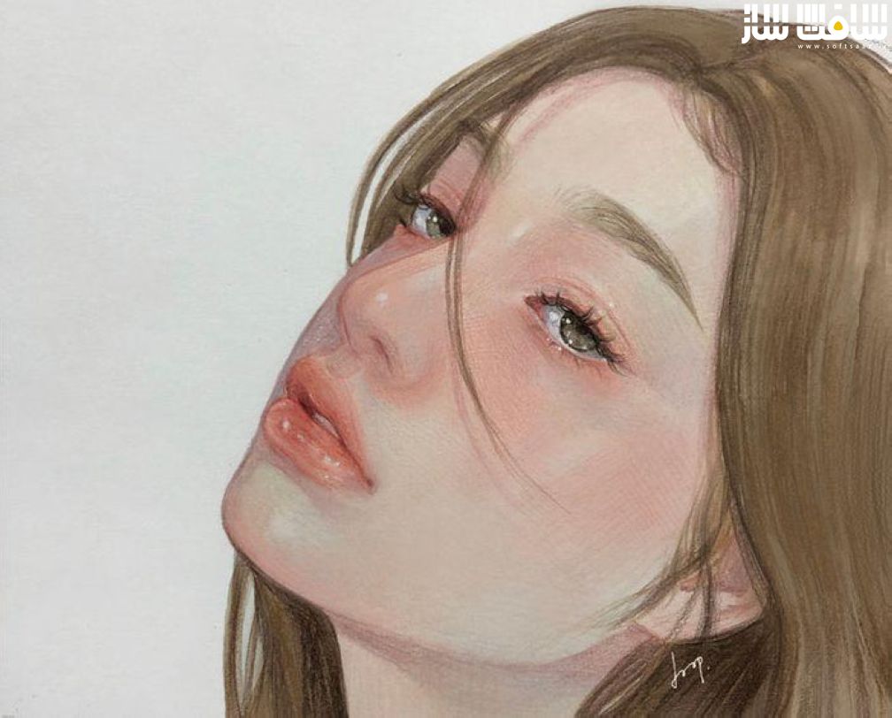
کشیدن پرتره رنگی
آموزش کشیدن پرتره رنگی از هنرمند Doop : در این دوره از سایت Class101 ، هنرمند Doop،با نحوه ایجاد پرتره های اتمسفریک و رنگی با استفاده از مداد آشنا خواهید شد. این کلاس روی رنگ آمیزی پرتره با آبرنگ و مداد رنگی نیز تمرکز دارد. ایشان روش های زیبایی برای استفاده از رنگ ها نشان می دهد.. این دوره آموزشی توسط تیم ســافــت ســاز برای شما عزیزان تهیه شده است.
عناوین آموزش کشیدن پرتره رنگی :
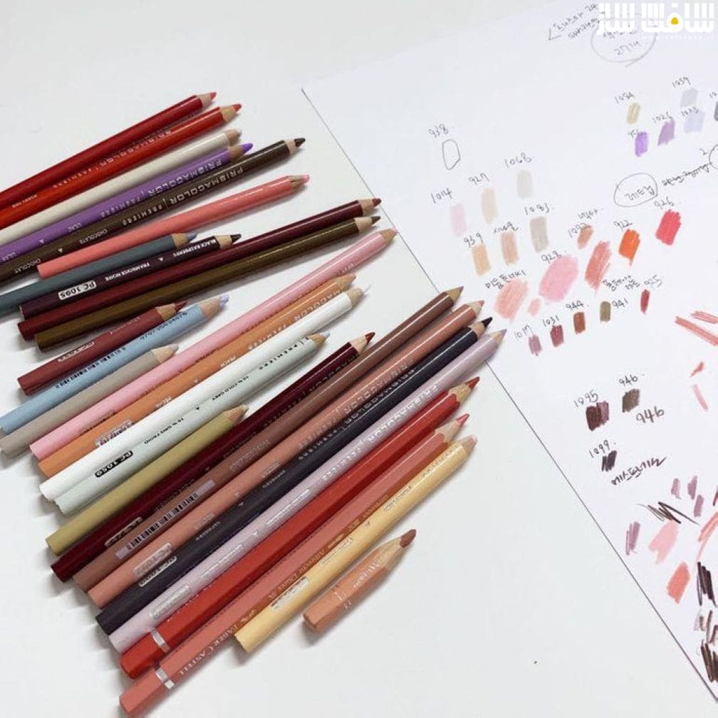
- همه چیز در مورد رنگ : تئوری و تکنیک های کامپوزیشن
- ترکیب با مداد رنگی : تکنیک های بلندینگ با خطوط های نرم
- استفاده از آبرنگ برای پر کردن رنگ های پایه
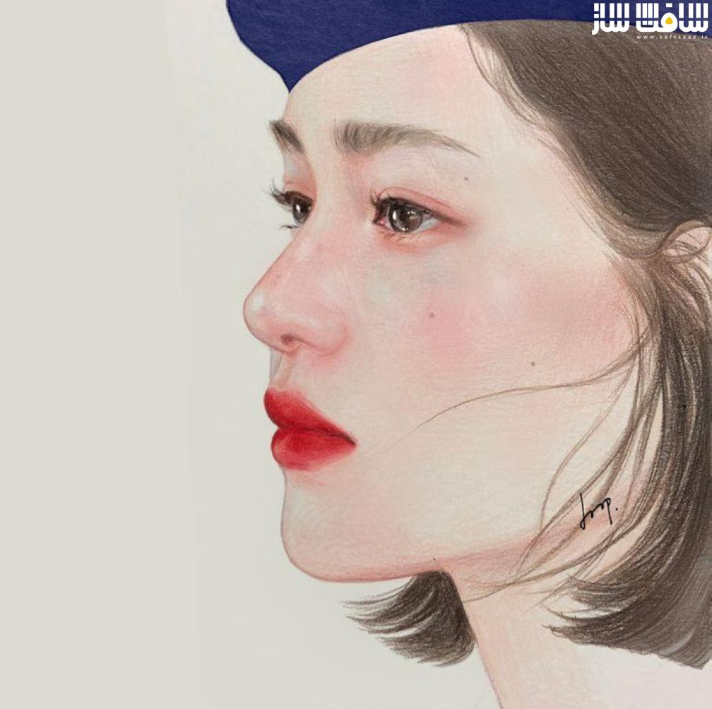
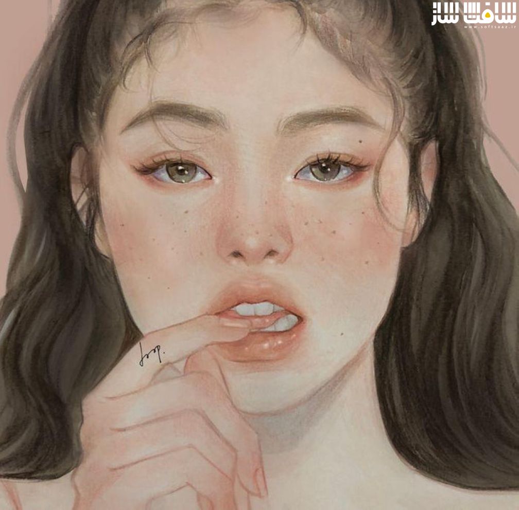
- ترسیم ویژگی های صورت از شکل گرفته تا تکنیک های رنگ آمیزی
- ایجاد پرتره های شبیه به زندگی واقعی
- انتقال کنتراست و بافت پوست
- نکاتی برای بتصویر کشیدن کنتراست و جریان با رنگ
- رنگ آمیزی برای پر کردن تن های صورت
- کپچر ظرافت مو : ظاهر طبیعی دادن به مو
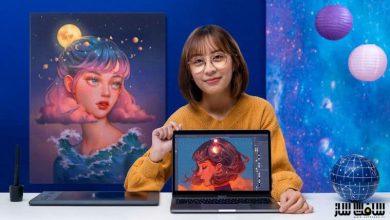
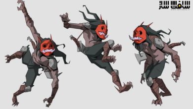
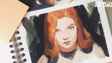
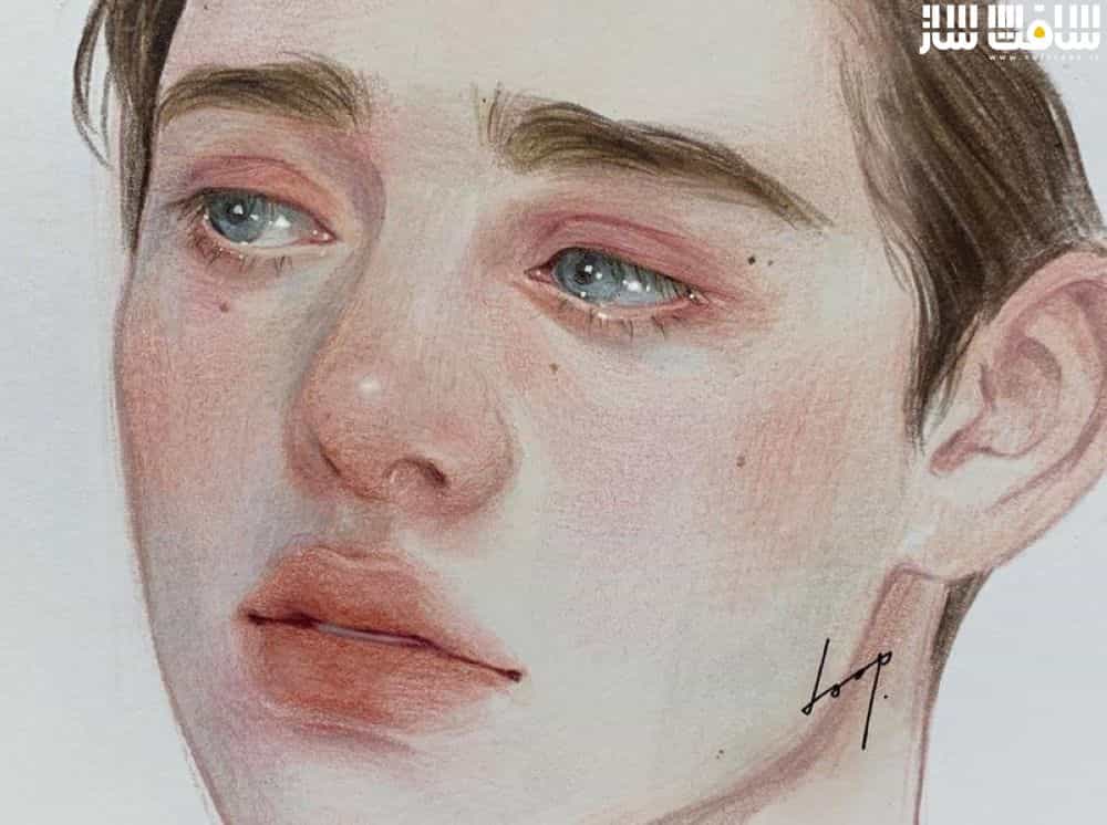
گالری دوره :

عنوان دوره : Class101 – Doop – Soft and Sensual Colors That Fill the Page: Doop’s Colored Portraits
سطح : متوسط
زمان کل دوره : 10.39 ساعت
تعداد فایل های تصویری : 29
سال آموزش : 2022
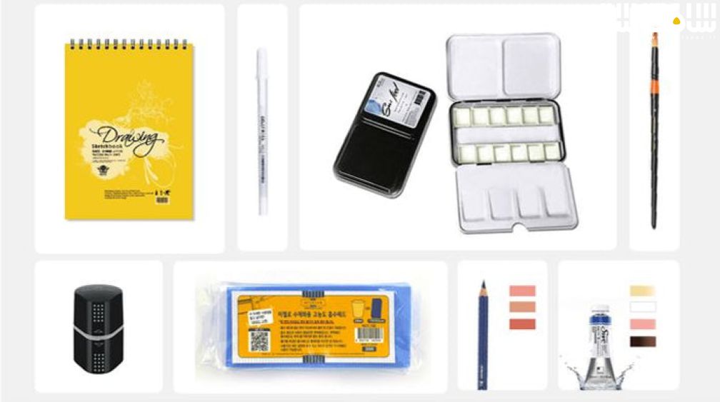
فایل تمرینی : دارد
مربی دوره : Doop
نرم افزار : –
زیرنویس انگلیسی : دارد
Class101 – Doop – Soft and Sensual Colors That Fill the Page: Doop’s Colored Portraits
In the last class, we drew portraits using only a pencil, so in this class, we will focus on coloring portraits with watercolors and colored pencils. For this, I have prepared a more colorful and in depth curriculum.
The Joy of Using Colors for More Detailed Drawing
Many of the people who have seen my drawings liked the colors the most and wondered how to use colors. The more colors you add, the more striking your portraits will be. I will show you beautiful ways to use colors.
I hope to erase any fears you have of using colors through this class. Depending on the colors of the shadows, the differences in contrast, and the colors that give your portrait life, there are many things that you can express. “Can I use this color here?” “Ah, this wasn’t what I wanted. I messed up” I have experienced this kind of situation more times than I can count, and so I would like to share all the things I’ve learned through these experiences so that you don’t go through as much trouble as I did. Together, let’s appreciate the joys of expressing ourselves.
Knowing and Combining Colors
I like using low saturation colors, like quiet warm colors mixed in with gray tones. I like them the most because when I see those colors, it puts my mind at ease. For me, it’s most fun to mix different colors and create many colors with low saturation.
The three most important things when expressing colors are hue, brightness, and saturation. The most important thing when drawing a picture is to make sure that the colors harmonize with each other. Even if there is a wide range of colors and brightness is used well, if the colors don’t harmonize with each other, the picture will look awkward. Therefore, you must be comfortable with the three basic elements of color to use colors harmoniously. After that, you will have more confidence in using colors and will want to try more varied expressions.
In this class, we will use more than just the standard “peach” color and instead, through color theory, focus on how to use colors and add colors to make a richer tone.
All About Texture and Tone
The texture of skin follows the flow of the face. Every shape has a direction. Rectangles have horizontal and vertical directions and ovals have a circular direction.
If you fill in the tone without considering these directions, no matter how good your sketch is, you will feel that there is a flaw in the shape somewhere. To add tone to match the shape, the best thing to do is to fill in tones based on the direction. I’ll teach you how to color along with the flow.
I think skin tone is the work that creates the mood of a person’s skin such as skin with yellow tones, red tones, or pale tones, all of which are skin tones that we are familiar with. Even using filters on your phone, you can create many moods. Learn which colors to use and which to avoid based on skin pigments and the three elements of color. After this class, you will be able to make these judgements on your own.
Vivid and Rich-Tone Portraits
As you draw the two portraits, you will learn with a focus on how to use colors in various ways. It isn’t simply contrasting the original peach color with a darker color, but combining similar colors to create subtle but life-like portraits with opposite colors depending on the facial contrasts. By the end of the class, I’ll make sure you’ll be able to create portraits with depth that look as though they are under lighting.
حجم کل : 12.6 گیگابایت

برای دسترسی به کل محتویات سایت عضو ویژه سایت شوید
برای نمایش این مطلب و دسترسی به هزاران مطالب آموزشی نسبت به تهیه اکانت ویژه از لینک زیر اقدام کنید .
دریافت اشتراک ویژه
مزیت های عضویت ویژه :
- دسترسی به همه مطالب سافت ساز بدون هیچ گونه محدودیتی
- آپدیت روزانه مطالب سایت از بهترین سایت های سی جی
- بدون تبلیغ ! بله با تهیه اکانت ویژه دیگه خبری از تبلیغ نیست
- دسترسی به آموزش نصب کامل پلاگین ها و نرم افزار ها
اگر در تهیه اشتراک ویژه مشکل دارید میتونید از این لینک راهنمایی تهیه اشتراک ویژه رو مطالعه کنید . لینک راهنما
For International user, You can also stay connected with online support. email : info@softsaaz.ir telegram : @SoftSaaz
امتیاز به این مطلب :
امتیاز سافت ساز
لطفا به این مطلب امتیاز بدید